

User Experience Design, Capstone Certificate
Strava: user research & usability testing
Summer 2026
I decided to choose Strava, “a fitness app that lets people track their runs, bike rides, walks, and other workouts using GPS, while also sharing their activities and connecting with friends." I chose this system because I love the app overall. I am an active person, and it aligns with my interests. It's also something different from a food or restaurant project, which is what much of my work has centered around. I think it's a great way to keep yourself engaged and connect with a community at the same time. Strava is also a great way to track your progress while staying disciplined.
The users I will be focusing on for Strava are runners, cyclists, and swimmers who are training for a race, fitness enthusiasts who want to connect with others in the fitness community, and individuals who are just beginning their fitness journey and want to track their progress. These groups are well aligned with Strava’s target audience and are likely to need the app’s features and services.
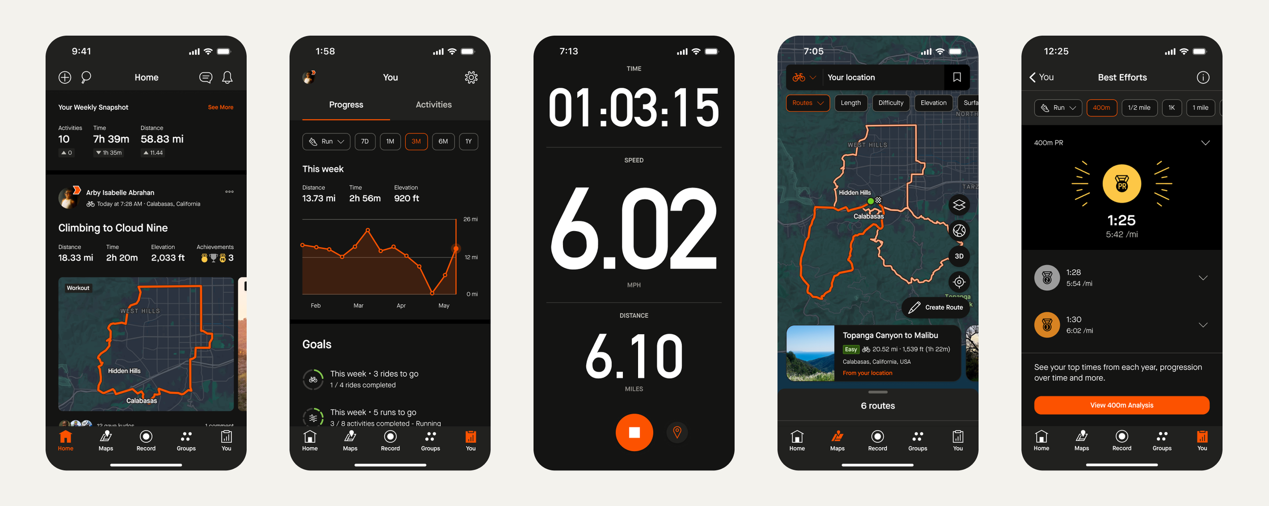
By studying these users, I hope to better understand how effectively Strava supports their goals and whether the app provides a positive user experience. I am particularly interested in learning whether new users can easily understand and navigate the app, as well as whether its features and information are useful for helping users achieve their fitness objectives. I want to evaluate if the app’s usability meets the needs of both experienced athletes and those who are using Strava for the first time.
To prepare for my usability test, I will need to conduct research to determine which tasks users should be asked to perform while using Strava. These tasks should reflect common goals and activities that users complete within the app so that I can accurately evaluate its usability and effectiveness.
I started my research by creating and distributing a Google Forms participant screener. I sent it to one of my peers who runs a fitness Instagram page and asked her to share the link on her Instagram story to reach users who matched my target audience.
Using the results from the screener and my research on the app, I created four tasks for participants to complete during the usability test. The metrics I chose to evaluate were task success and error rate, allowing me to measure whether participants could successfully complete each task and identify any usability issues they encountered.
-
You recently started training for a 10K race. Show how you would record an outdoor run.
-
You have been working out for a month and want to check your progress. View your progress calendar/streak calendar
-
You want to get involved with your community and make new friends regarding fitness. Follow a Strava Running club.
-
You want to see what your friends are doing for working out and give them support. Give another user kudos (like) on their post on the home feed.
After conducting the usability pilot and reviewing how I could make my testing more efficient for both the participants and myself, I interviewed six additional participants. The questions asked before, during, and after the usability test provided deeper insight into the participants' prior knowledge, their thoughts while completing each task, and their overall opinions of Strava after the test.
The pre-test questions helped me understand each participant's background, familiarity with the app, and responses to the participant screener. During the test, I asked follow-up questions to better understand each participant's thought process and how they felt while completing each task. The post-test questions allowed participants to reflect on the overall usability of Strava and share their final opinions.
The questionnaire included yes-or-no questions, 1-to-5 rating scale questions, and open-ended questions to collect both quantitative and qualitative feedback.
From there, I selected two participants and conducted a pilot usability test with them in a public space. I created a consent form that each participant signed and dated before beginning the study. I also prepared pre-test, during-test, and post-test questions, along with a printed task sheet for participants to reference throughout the session.
During each test, I used my own Strava account on my phone while taking notes and recording the session using the Apple Voice Memos app. After completing the pilot tests, I reworded several of my tasks, reflected on my performance as a moderator, and decided to purchase Strava's free trial before my final usability testing. This ensured participants had access to the app's full functionality and could complete the tasks without being limited by locked features.
Usability Testing
Participants Demographics
Including two pilot participants and six final participants
Using the responses from the Google Participant Screener, I recruited a total of eight participants with a range of ages, genders, and fitness interests to participate in the user testing sessions.
4 male participants and 4 female participants
Ages: 20, 22, 23, 25, 26, 27, 28, 37 years old
4 White, 2 Black or African American, 1 Hispanic or Latino, 1 Middle Eastern or North African (MENA)
All are daily to weekly active individuals
Half have used Strava, half have not
All participants give different demographics and experiences with the app.
Results
-
The easiest tasks for participants to complete were recording an outdoor run (Task 1) and giving kudos ("like") on a post (Task 4). For Task 1, 7 out of 8 participants rated it as 5 (very easy). Similarly, for Task 4, 7 out of 8 participants also rated it as 5 (very easy). These tasks were the most straightforward, with those seven participants completing each one in less than 8 seconds.
-
The hardest tasks for participants to complete were checking their progress streak calendar (Task 2) and joining a Strava running club (Task 3). For Task 2, 3 out of 8 participants rated it as 5 (very easy), 3 out of 8 rated it as 4, and 2 out of 8 rated it as 1 (very difficult). Many participants did not realize the streak calendar was located on the “You” profile page and that they needed to tap the streak icon to view the calendar. Instead, several participants tried more complicated navigation paths, and one participant only found the membership version of the feature, preventing them from completing the task. For Task 3, 5 out of 8 participants rated it as 5 (very easy), 1 out of 8 rated it as 4, and 2 out of 8 rated it as 2. Participants struggled because there were two different ways to find clubs. While there is a Clubs icon in the navigation bar, others used the search function, which includes separate sections for users and clubs. This caused some confusion and increased the time needed to complete the task. These tasks generally took participants longer to complete, ranging from about 10 seconds to 1 minute
-
Participant #1 was the outlier in this study. He was unable to complete 2 of the 4 tasks and experienced issues with features that required a paid membership, which should not have affected the usability test or appeared during the assigned tasks. As a result, he became the most frustrated participant and had a more negative overall impression of the app by the end of the study.
Overall, participants found recording an outdoor run and giving kudos to be the easiest tasks, with nearly all users completing them quickly and rating them as very easy. The most challenging tasks were checking the streak calendar and joining a running club due to confusing navigation and multiple paths to the same features. One participant #1) was an outlier because membership-related screens prevented him from completing two tasks, leading to frustration and a more negative overall impression of the app.
Design Implications
On the “You” profile page, designers should add clearer navigation to help users view their streak calendar more efficiently. Making the streak calendar easier to find is important for users who rely on the app to track their fitness goals and monitor their progress. The app should include a short tooltip the first time a user earns a streak to show them where the streak calendar is located.
#1 Streak calendar
Designers should clearly distinguish features that are only available with the premium version of the app. The current membership pop-ups take over the entire screen, which can become frustrating for users trying to complete simple tasks. Clearly labeling premium features and reducing intrusive pop-ups would improve the user experience and may prevent users from switching to less frustrating alternatives for tracking their workouts.
#2 Free trial Pop-ups
Designers should create clearer and more consistent navigation paths so users know the best way to complete tasks. For example, users could access Clubs through both the navigation bar and the search function, which confused testing. Since the Clubs navigation button provides the most complete information and is the most efficient route, Strava should make this the primary path while using search to direct users to other users.
#3 consistency across navigation paths
Providing an onboarding tutorial that users can access again at any time would improve efficiency and the overall user experience. This feature would teach users the clearest and most effective ways to navigate the app and locate its key features, helping them use Strava to its full potential. Making the tutorial available beyond the initial setup would also benefit returning users who need a refresher or want to learn about new features.