User Experience Design, Capstone Certificate
The Seminole Tap Redesign: Research & Insights
Fall 2025
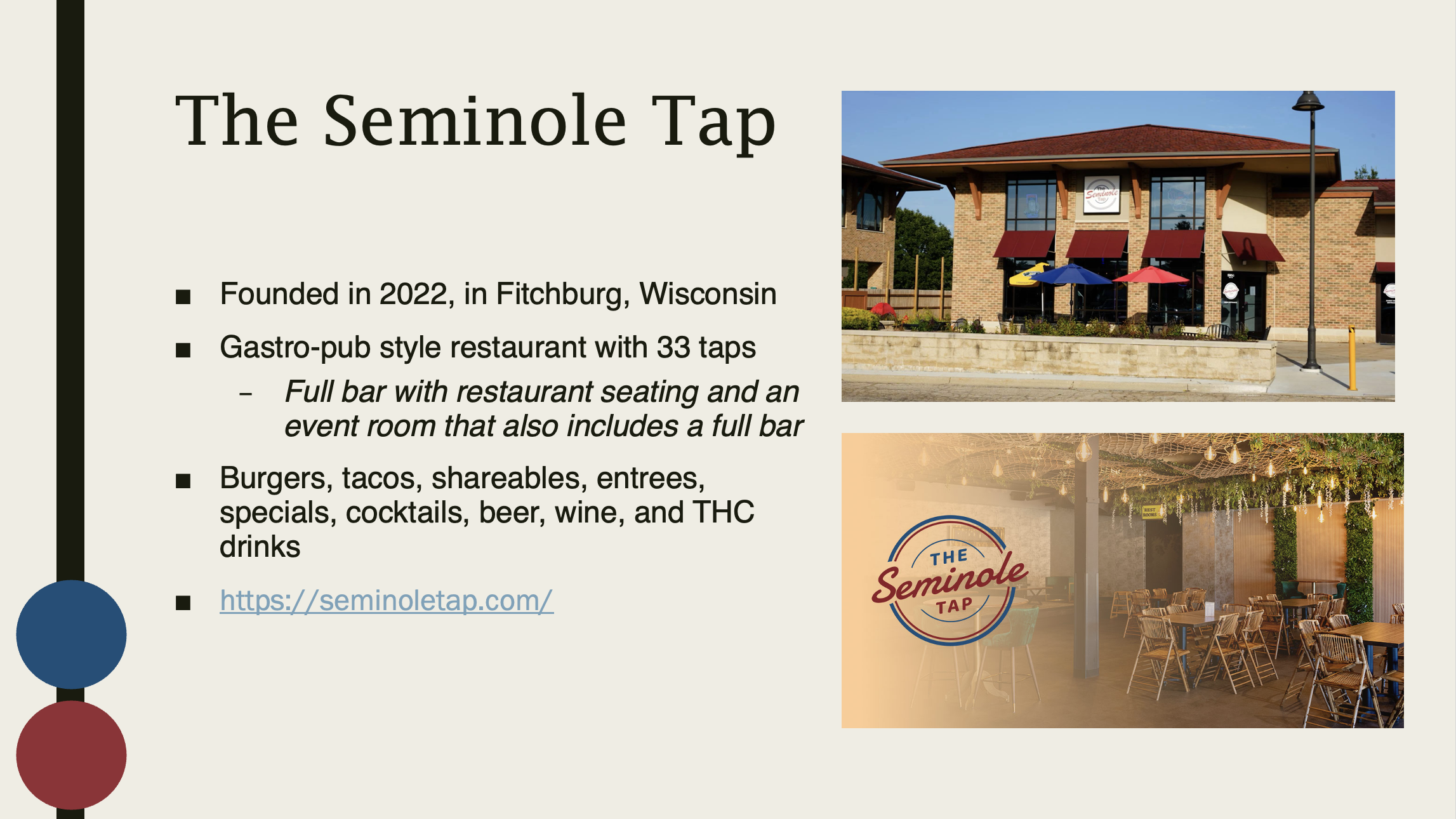
For the first semester of my User Experience capstone certificate, LIS 611: User Experience I, the focus was on research. I chose to center my project on the organization where I was working at the time and later completed a winter internship.
I conducted in-depth research on their usability interface, user base, key challenges, and potential solutions. This work laid the foundation for my decision to continue developing this project throughout the remainder of my capstone.
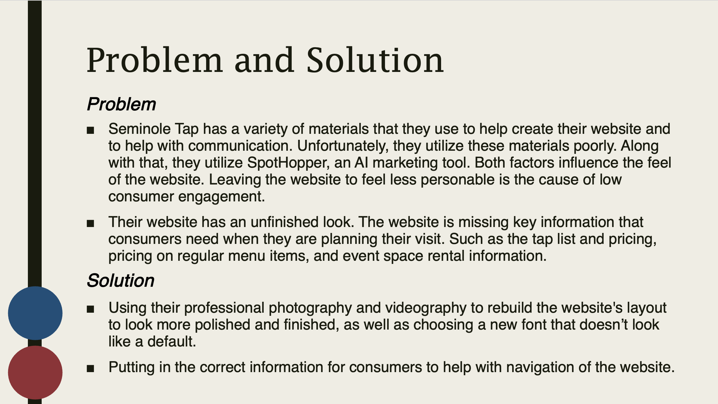
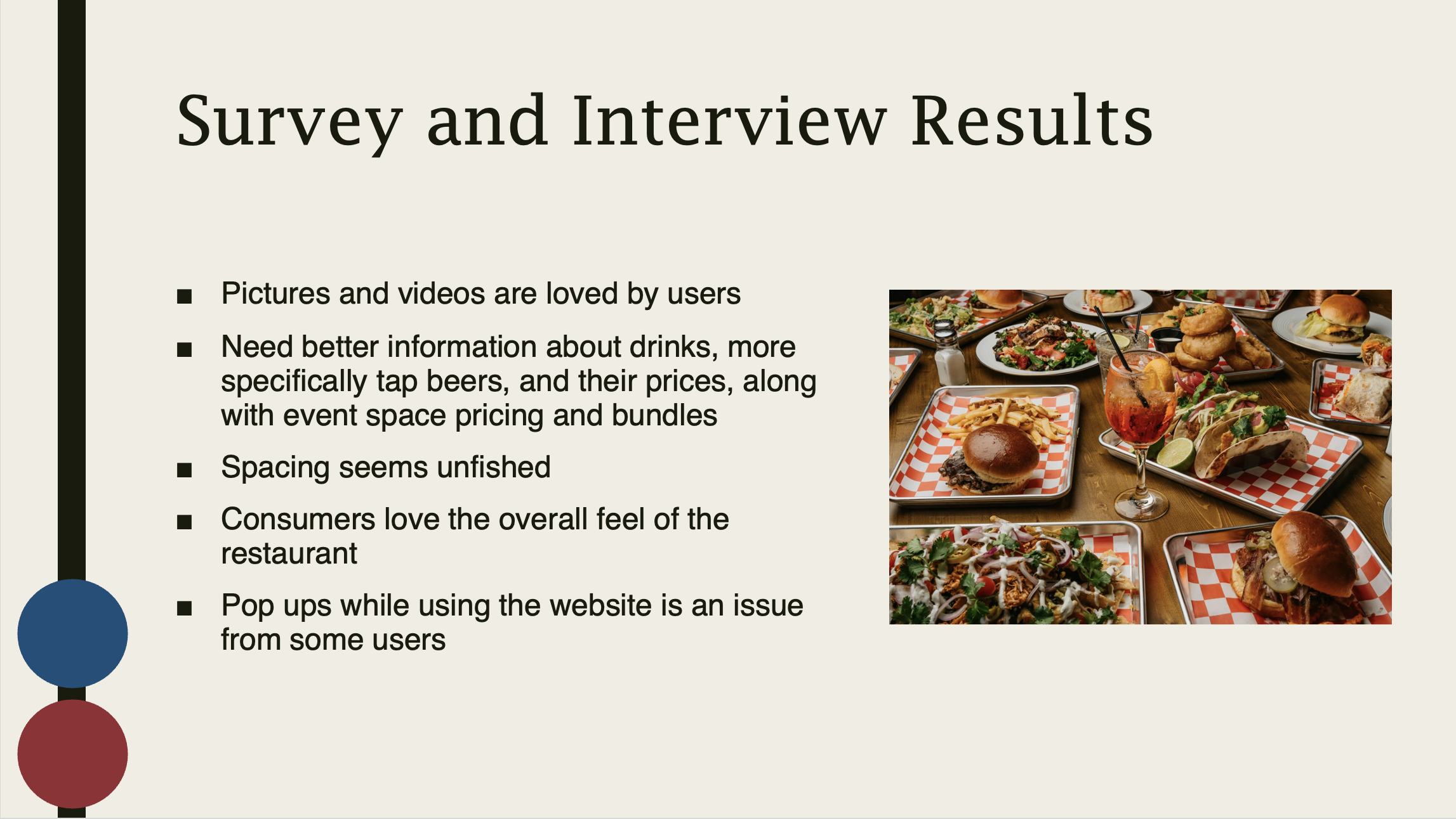
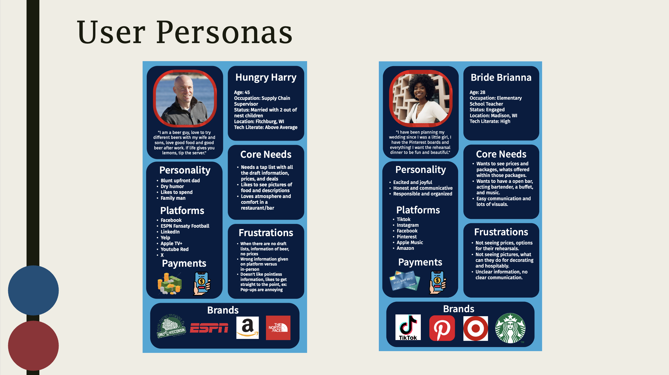
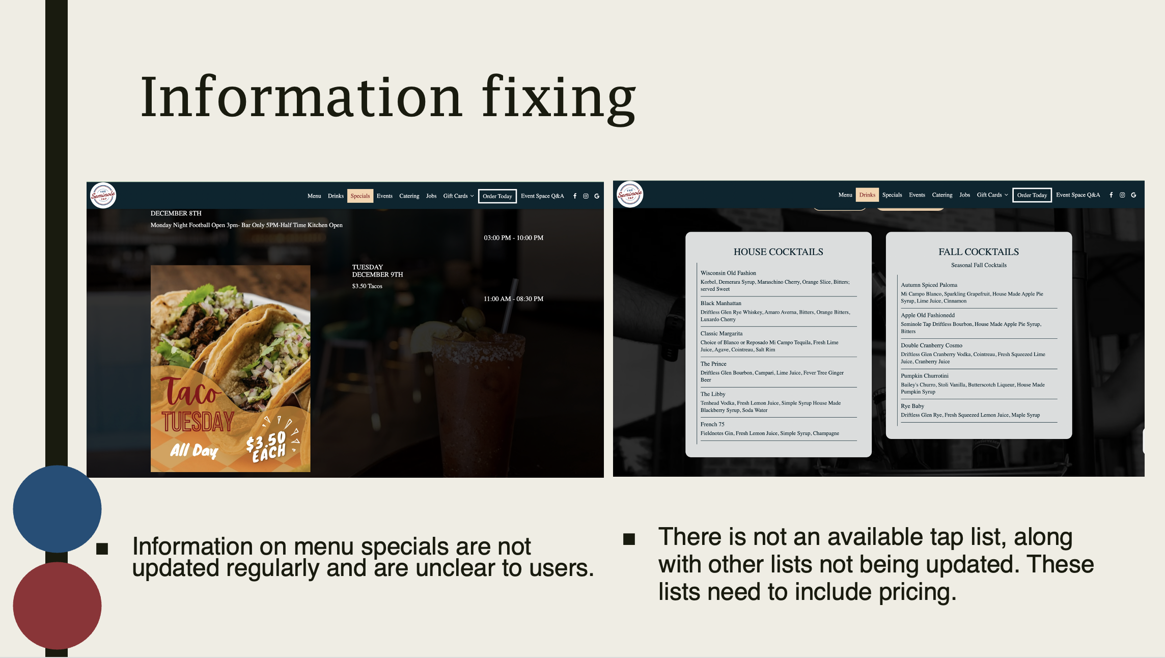
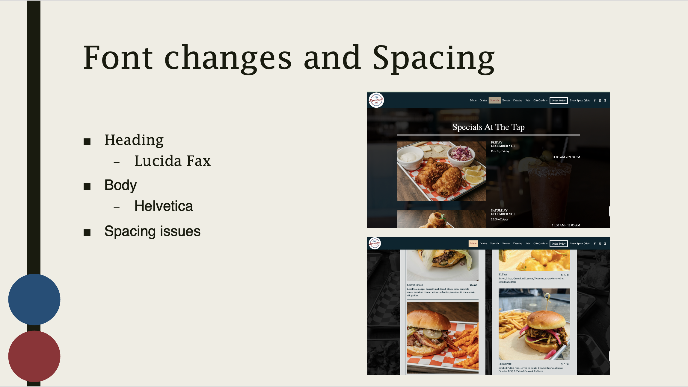
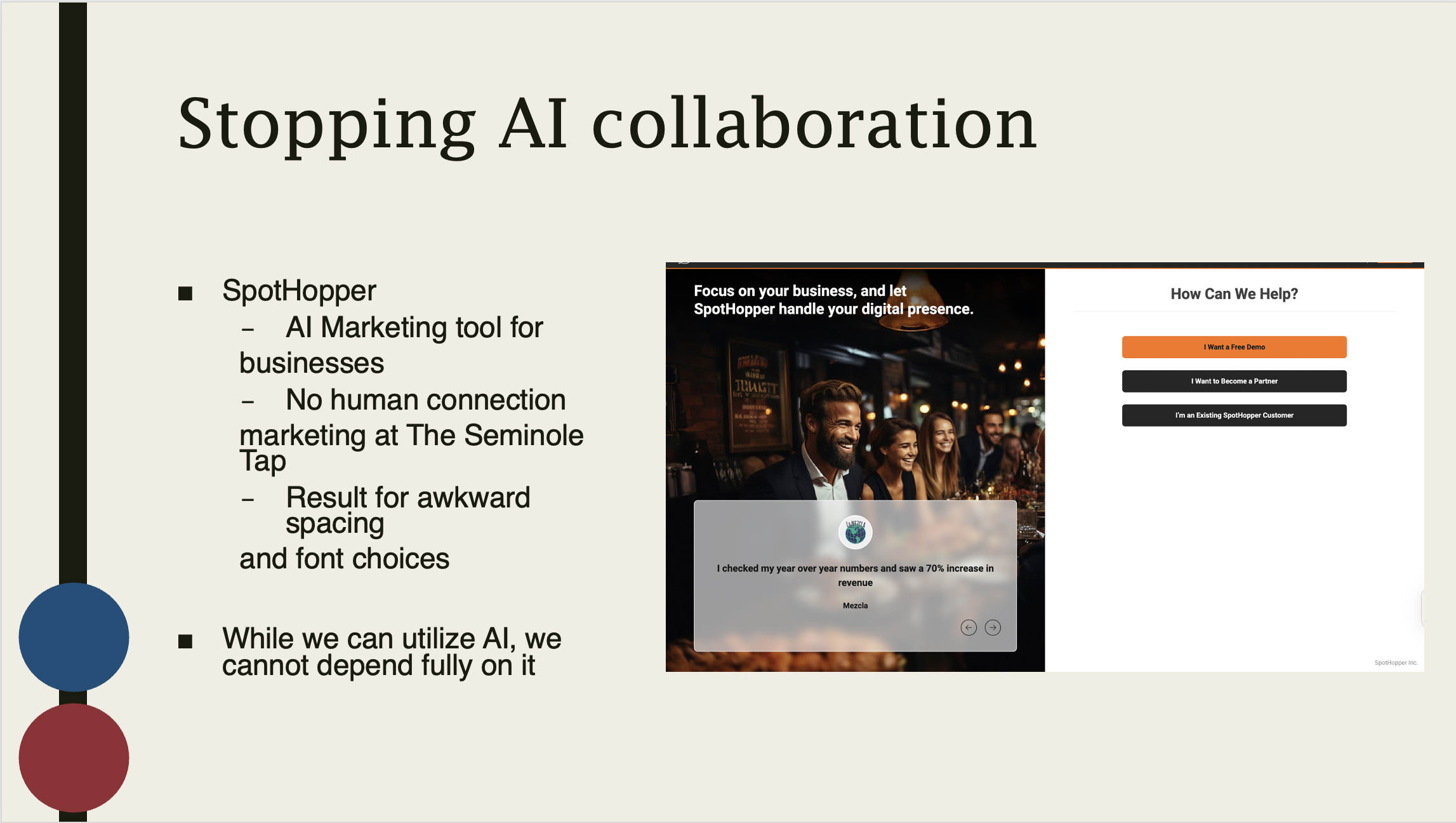
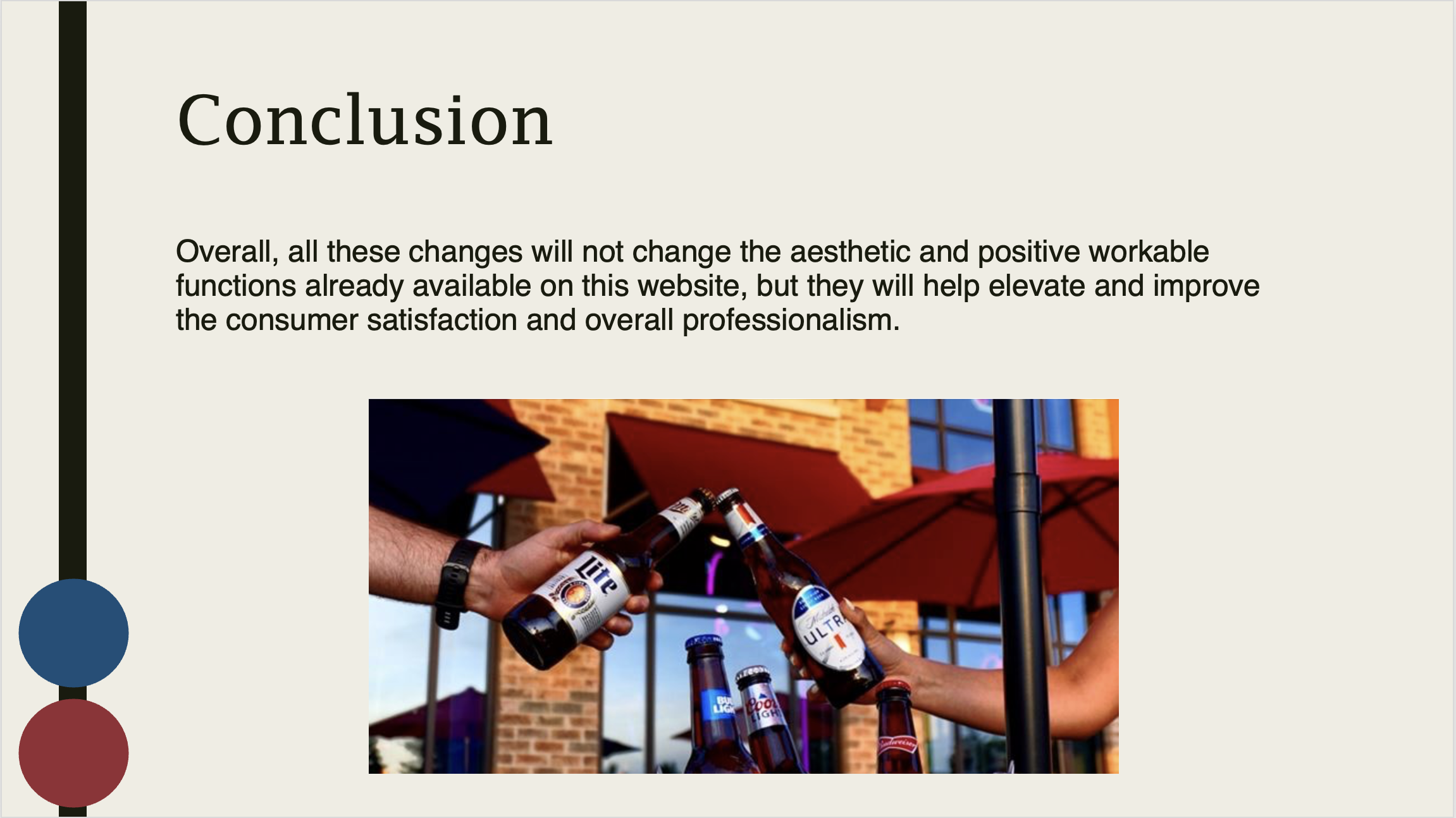
Below are the final presentation slides from the research portion of my capstone.
User Experience Design, Capstone Certificate
The Seminole TAP Redesign: From Research to Interactive Prototype
Spring 2026
For the second semester of my User Experience capstone certificate, LIS 612: User Experience II, the focus shifted from research to design execution. Building on the research and insights gathered in the first semester, I continued developing the Seminole Tap redesign by applying the full user experience design process, as well as their branding, changing from The Seminole Tap to The Seminole.
Throughout this course, I explored brainstorming, sketching, and iterative design, emphasizing the importance of peer feedback and critique in refining ideas. I developed paper prototypes and translated them into interactive prototypes, bringing the user experience to life.
This phase also focused on visual and interaction design elements, including color systems, typography, and animation, to create a more engaging, usable, and cohesive interface.
Below are the final presentation slides and prototype work from the design and prototyping phase of my capstone.
-
How might we help first-time and returning Seminole Tap customers quickly understand what’s happening tonight: events, specials, and promotions, so they can confidently decide when to go and what to expect?
How might we create an app for Seminole Tap that clearly communicates everything they offer, especially information that is missing or unclear on their website and social media?
-
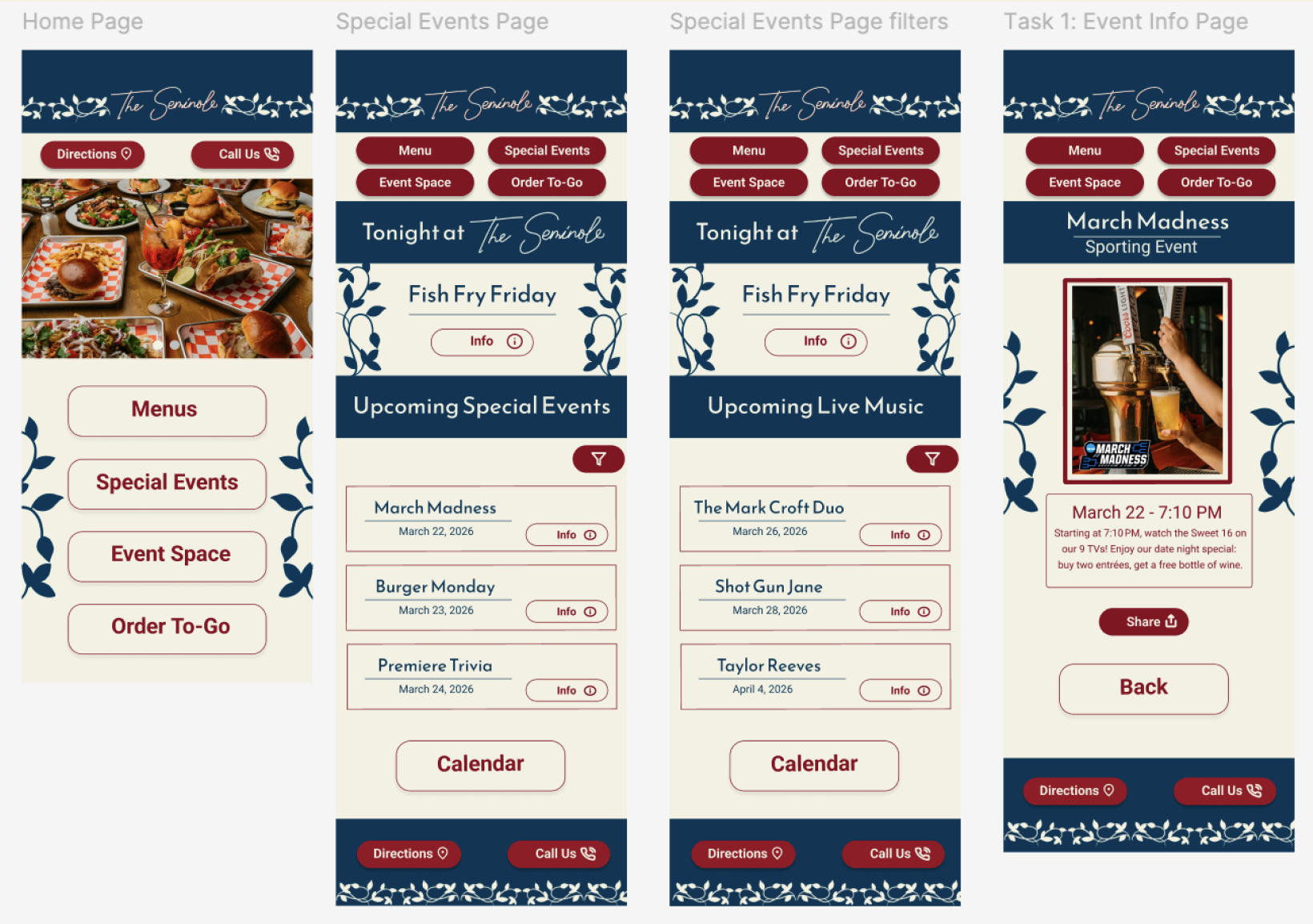
I created a dedicated specials and events page to clearly communicate what is being offered and what users should look out for. This helps drive foot traffic and strengthen their online presence. Promoting events online encourages users to share with others, increasing visibility and engagement.
-
Task 1: Find info on an upcoming Special Event on March 22 and share it via copying.
Task 2: Go to the Special Event calendar and filter to live music, click on March 26th to see what live music is showing that night.
Task 3: Filter the Special Event page's upcoming events to live music. See the info on the upcoming live music on March 26.
Brainstorming
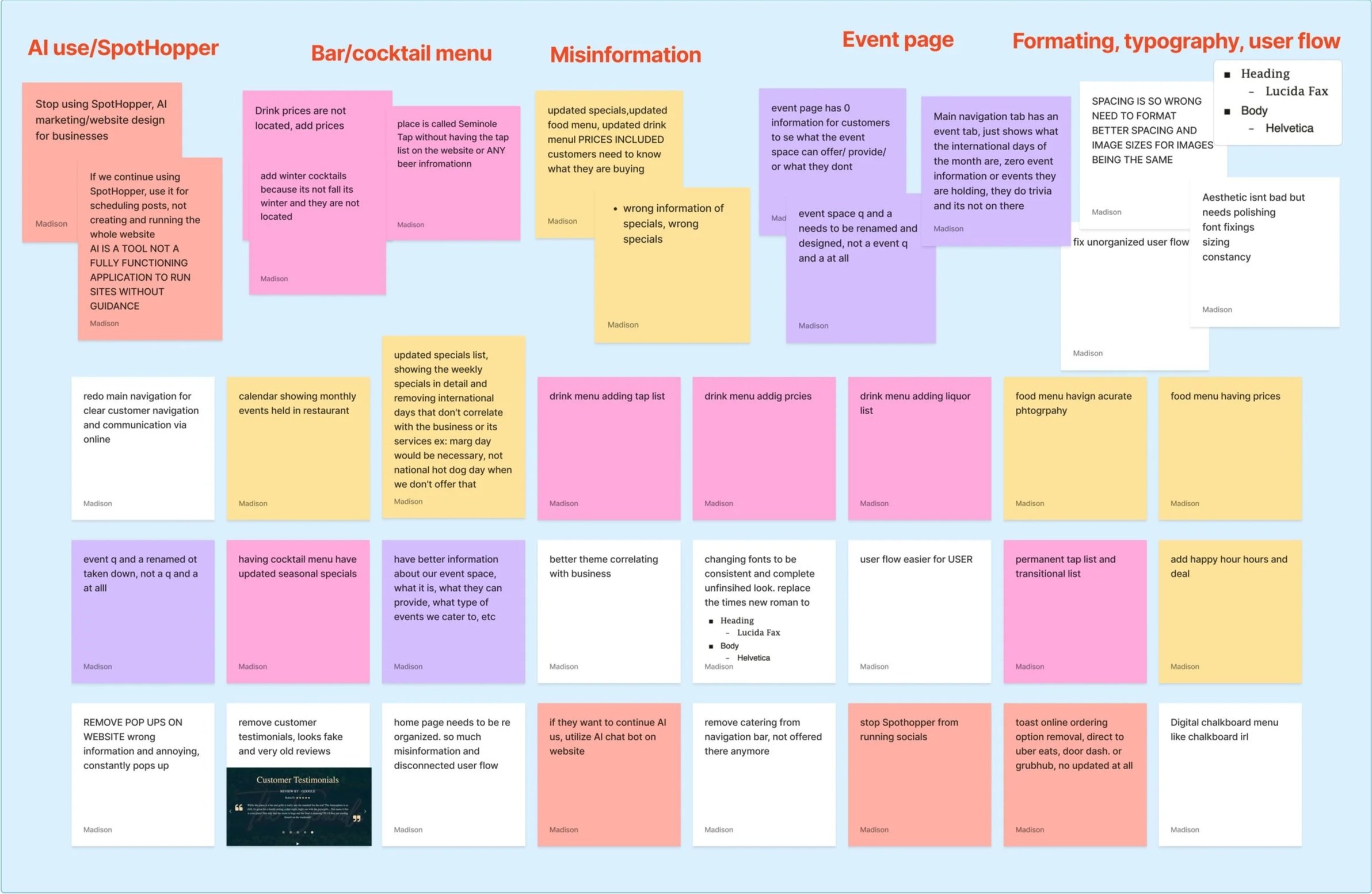
After creating multiple sketches on my iPad and exploring different user task flows, I identified a design that met my core goals. I later revisited and refined these flows to make them more functional and user-friendly.
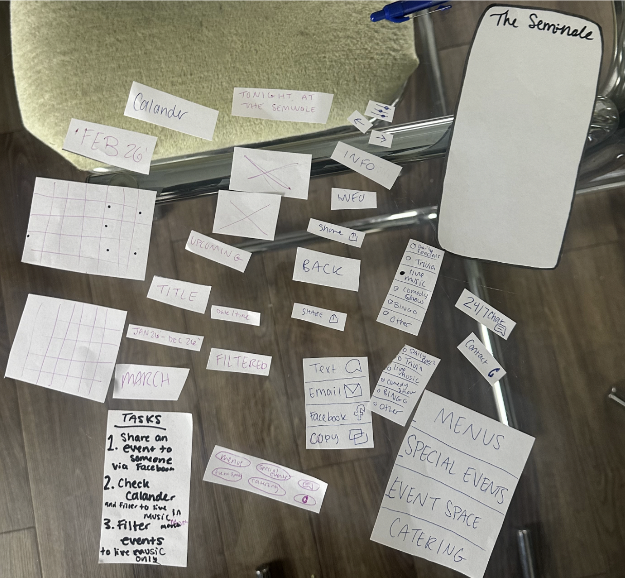
Paper prototyping with test users helped me understand how new users interact with the app, especially those unfamiliar with the project. This revealed how people naturally navigate tasks and where improvements were needed.
This hands-on process allowed me to engage more deeply with my design and better understand the user experience.
Paper Prototyping
The solution minimizes confusion by clearly showing what is happening at The Seminole tonight, later this week, and in the months ahead.
It improves communication by providing easy access to directions and direct calling to the restaurant.
Filtering options allow users to find specific events or specials quickly.
A calendar view gives users a clear overview of all upcoming events.
A structured list display highlights upcoming offerings in an easy-to-scan format.
Sharing features make it simple for users to send event information to friends and family.
How the Solution Solves User Problems
Wireframe Draft and Annotating
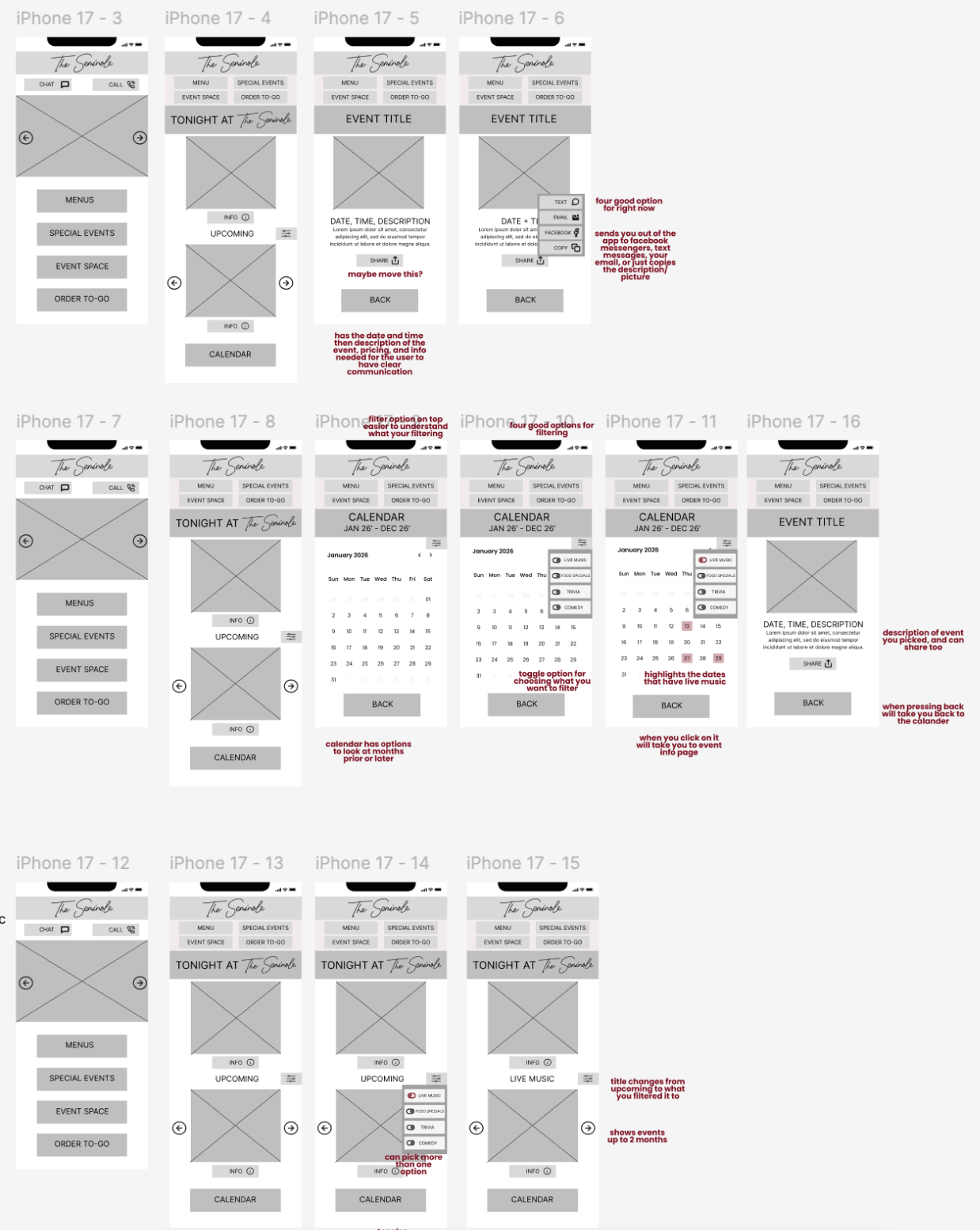
Many changes were made throughout my design and interactive features based on peer feedback and issues I identified during testing.
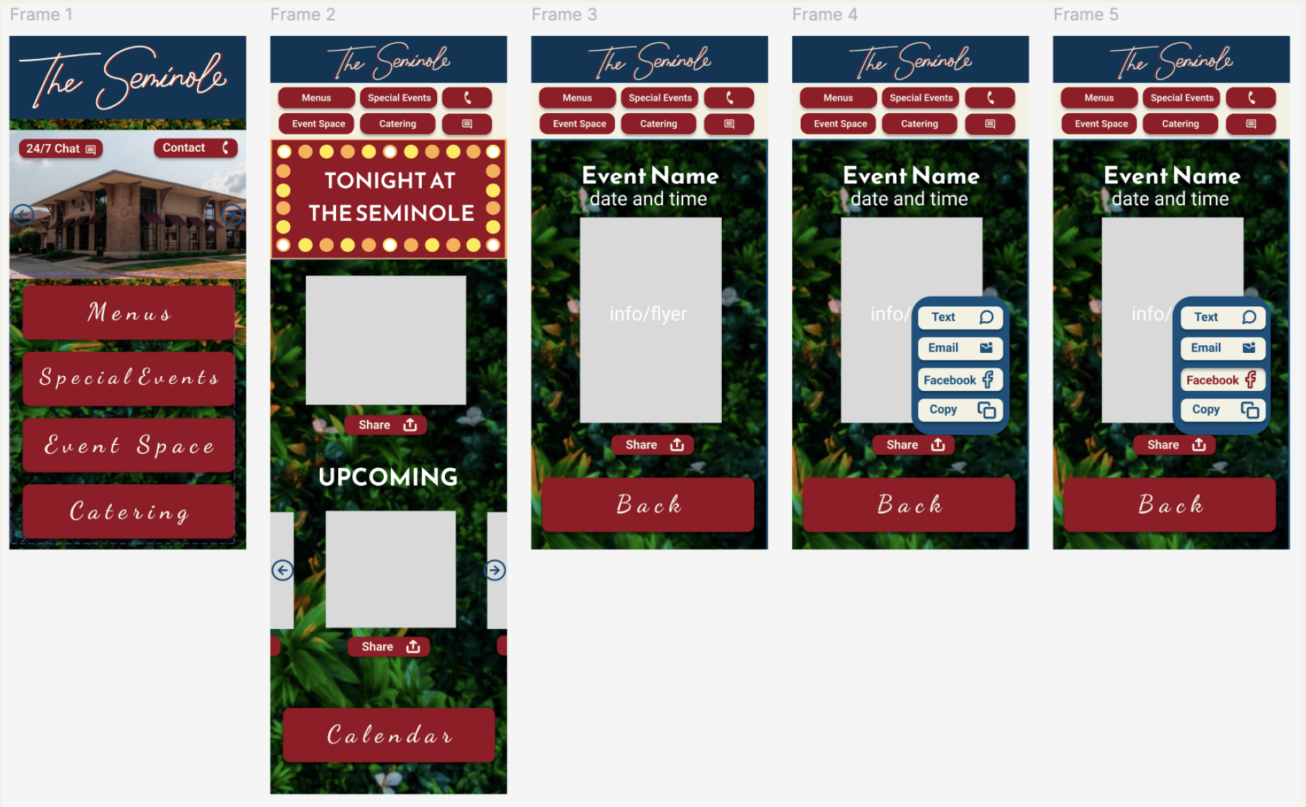
I simplified the interface by using a clean, minimal background to improve readability and overall usability. I refined spacing, enhanced button interactions, reduced long scrolling screens, and replaced busy images with clearer, easier-to-read text.
I incorporated greenery inspired by the restaurant’s event space and brand colors. I designed a subtle vine element to add creativity and personality without overwhelming the interface, like the prior greenery background.
Reorganized the layout by adding footers to reduce clutter in the top navigation. I repositioned features like 24/7 chat and directions, updated the “Tonight at Seminole” section to match the design system better, and created a cleaner display for upcoming events so users can easily find all the information they need, aligning with my overall “How Might We” goal.
Changes within project
I learned that drafting, sketching, and brainstorming are not one-time steps but an ongoing part of the research and design process that continues throughout the project.
Not stopping this process leads to a stronger project, often resulting in a final outcome that is better than originally imagined.
Animation can make an app feel more alive while helping connect pages and improve overall flow and user experience.
Minimalism is not a bad thing, because what can be clearly understood is more important than overly complex design.
Most importantly, I learned that design should not be influenced by personal bias because we are designing for users not ourselves. This means considering different user limitations and making sure the app is understandable even for someone seeing it for the first time.
What Was Learned
Interactive Prototype
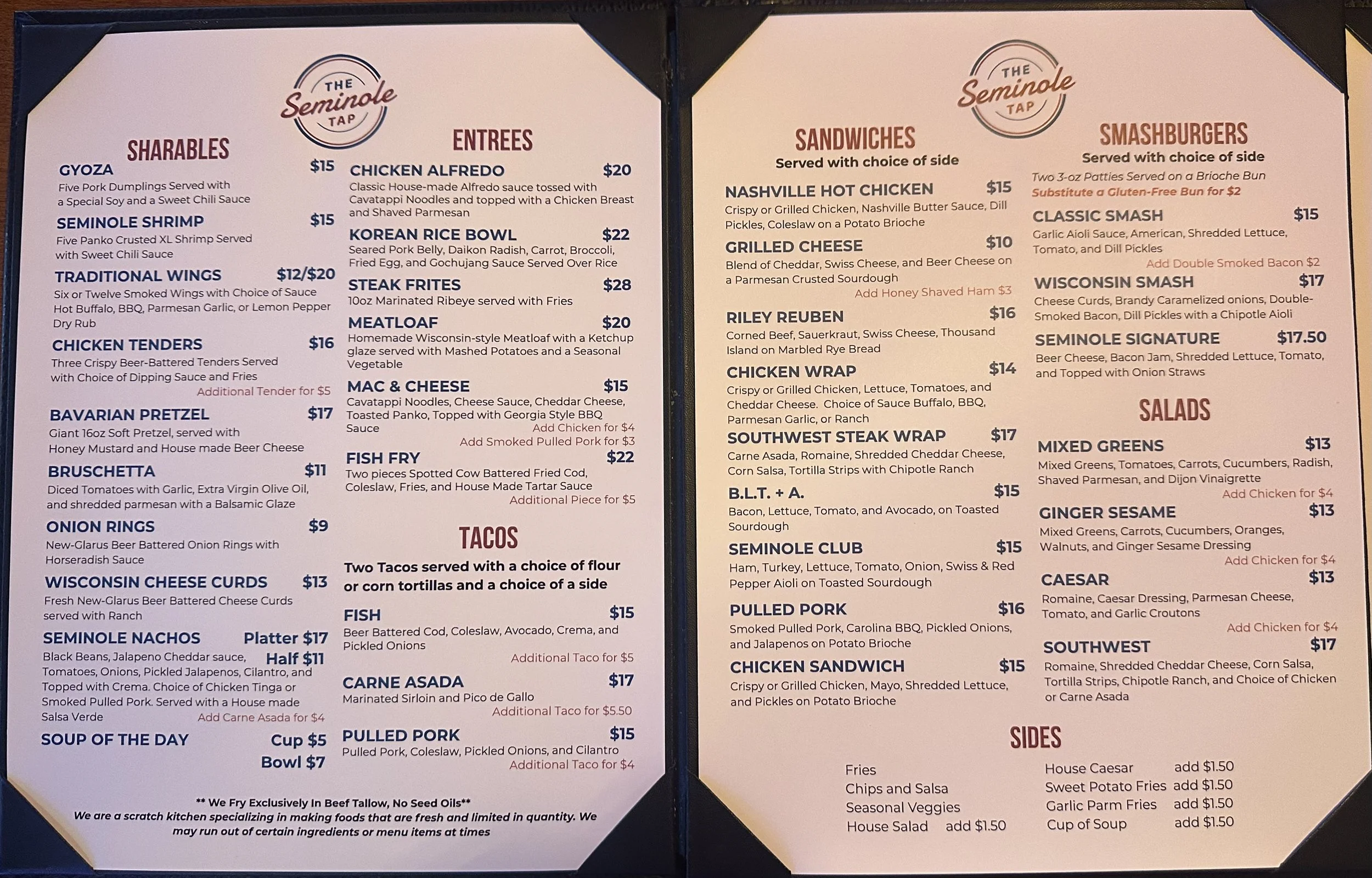
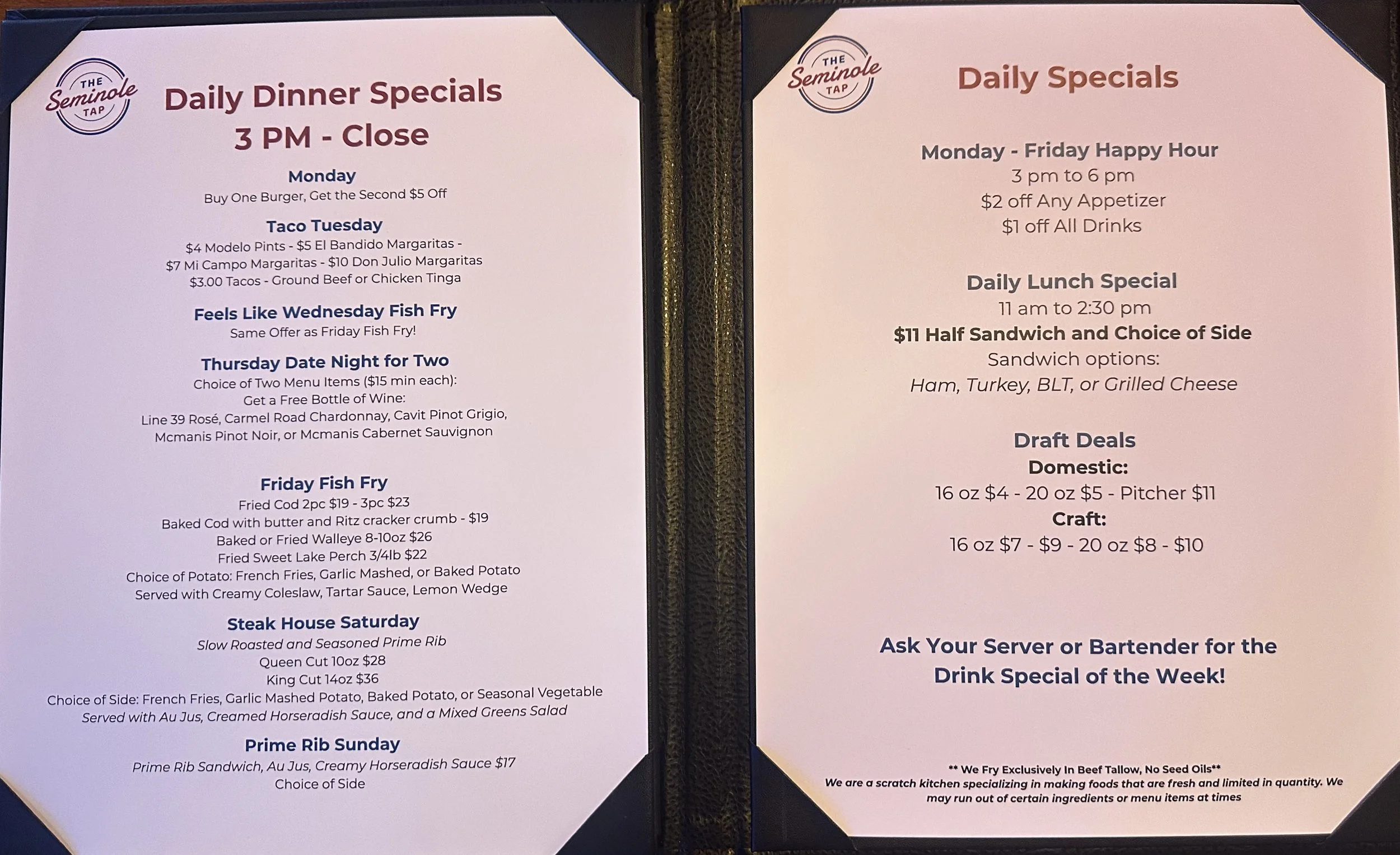
Menu Redesign
Graphic design and social media internship
Canva
March 2026